Week 12

Final week!

This week has been dedicated to code cleaning and documentation.

Working on this project has been a great learning and professional experience. Up to date, this internship is the most valuable professional experience I have ever had.

This work can be extended to other files like HPCC log files in order to confirm the effectiveness of the approaches used and also make the algorithms more robust, applicable to a variety of log files.

Also, this work could be extended by adding some modules which will provide clues about root causes of the detected anomalies.

Finally, this work can be leveraged by the implementation of a streaming anomaly detection system. Indeed, the algorithm designed in this project works in batch mode. A streaming version would analyze the log file in real-time and be able to detect anomalies timely as the logs are recorded.

Infinite times Thanks to HPCC Systems and especially to my dedicated supervisors 🙂
Week 11

This week has been dedicated to finalize the code.

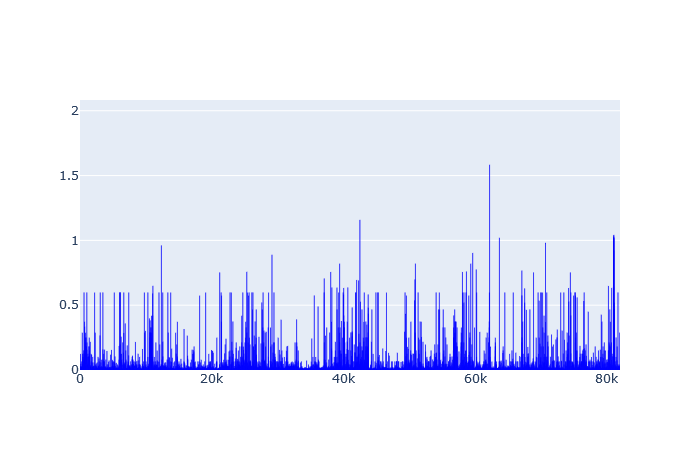
For user anomaly detection, I ended up choosing one cluster to run K-Means algorithm. The following graph shows a plot of the distance of all the vectors to the centroid.

User anomaly detection distance plot

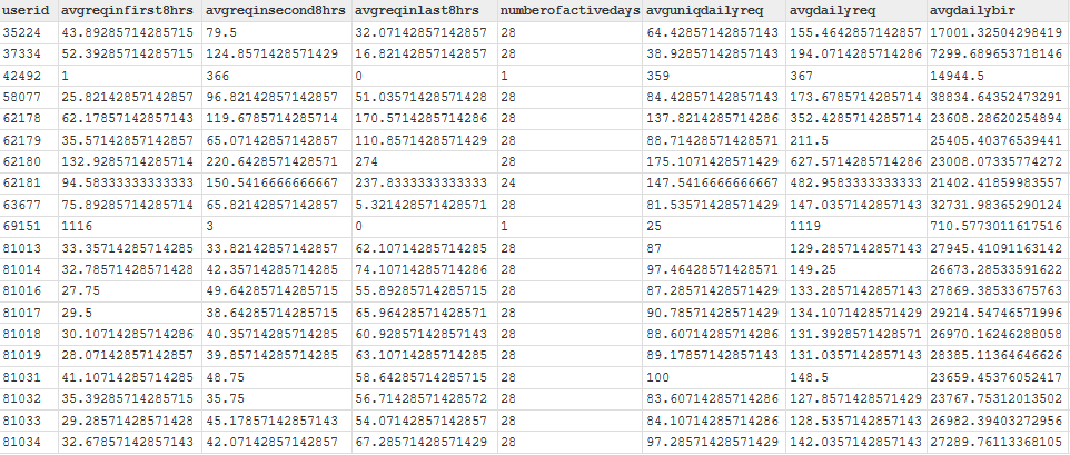
From this plot, “1” was selected as distance threshold after which users would be considered potentially abnormal. After applying the filter I got the following 20 potential abnormal users:

Potential abnormal users

Among the 20, we can see that there are 18 who have been active 28 days. That is, they have been active everyday. Note that the dataset is a record of a month of activity. Those users are clearly the most active ones and therefore may require some investigation. The two others have been active only on one day but seem to have submitted the highest number of queries in a day. Who knows why.

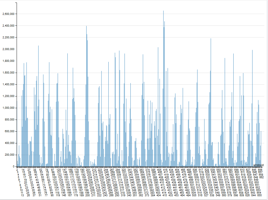
For workflow anomaly detection, I ended up going with 2 clusters. The following graphs show a plot of the distance to centroid for each cluster:

From this plot, I selected thresholds for each cluster and got the following 11 potential abnormal windows:

Comparing those potential abnormal windows to the centroids, we can conclude that they respectively represent windows with highest (on the left) and lowest (on the right) activity.

Week 10 – Day 5

With my features (count of the most interesting 3 events) extracted, I made a previsualization of the vectors to have an idea of the number of clusters I will be using for K-Means Clustering.

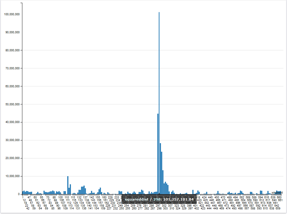
The previsualization suggests one cluster. Therefore, I went for one cluster and run K-Means. With the result, I computed the distance to the centroid as can be shown in the figure below:

I used the preceding graph to set 100,000,000 as my treshold to detect abnormal windows.

Week 10 – Day 3

Today, I got an issue with the dimensionality of my vectors. As explained in my previous post, my vectors will be made of counts of the number of times each unique request occur within the various one hour windows. That means that the dimension of my vectors will be equal to the number of unique requests. However, my dataset contains about 20 000 requests. That is a too large dimension.

To reduce the dimension I tried to get requests types instead. So for example, the following three unique requests:

  • HEAD /shuttle/technology/images/srb_16-small.gif HTTP/1.0
  • HEAD /shuttle/missions/sts-71/mission-sts-71.html HTTP/1.0HEAD /shuttle/technology/images/srb_16-small.gif HTTP/1.0
  • HEAD /shuttle/missions/sts-71/sts-71-patch-small.gif HTTP/1.0

can be set to be same request type “HEAD /shuttle/”. To get such request types, I used an implementation of Spell ( [ICDM’16] Spell: Streaming Parsing of System Event Logs, by Min Du, Feifei Li) , an online log parser. The implementation was done by the LogPai team and can be found at https://github.com/logpai/logparser. After running the log parser on my dataset, I ended up with 30 requests types, as shown in the figure below:

I will most probably ignore the requests types occuring less than 10 times.

Week 10 – Day 1

This week will be dedicated to the second anomaly.

As mentionned in an earlier post, I did change my second target anomaly. Instead of monitoring requests’ running time which is not possible with the new dataset, I will now be targeting workflow anomalies, I will be looking for patterns in requests’ submission like “having a request always being submitted between 9:00 AM – 10:00 AM” for example.

To achieve that, my features will be a count of the number of each requests made within windows of one hour.

Week 9 – Day 5

Finally, I decided to go with one cluster. This choice has been made from the graph shown below which shows my full users’ dataset. To plot the 3D graph, I selected 3 of the most representative features. The graph shows one cluster with some outliers which are our target.

Week 9 – Day 4

Today, I got some output.

I used K-Means to cluster my vectors.

To find anomalies, I use bar charts with “user ID” on the x-axis and “distance to the centroid” on the y-axis. So, for each user’s cluster, I plot a bar chart showing the distance of all the members of the cluster to the centre of the cluster. An abnormal user will be one which is very far from the centroid. The figures below show the bar charts when running the algorithm respectively with 2 and 4 centroids.

Distance to centroids using 2 clusters
Distance to centroids using 4 clusters

All those users lying very far from their centroid are potential abnormal users. Having this, I now need to decide on a final number of centroids. I intend to determine that number by making some analysis (visualization) on my initial vectors.