This week has been dedicated to finalize the code.
For user anomaly detection, I ended up choosing one cluster to run K-Means algorithm. The following graph shows a plot of the distance of all the vectors to the centroid.
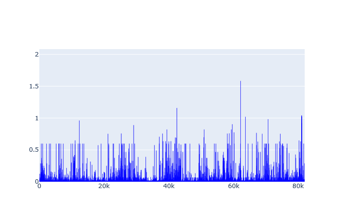
From this plot, “1” was selected as distance threshold after which users would be considered potentially abnormal. After applying the filter I got the following 20 potential abnormal users:
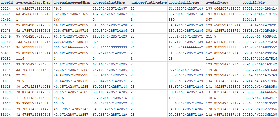
Among the 20, we can see that there are 18 who have been active 28 days. That is, they have been active everyday. Note that the dataset is a record of a month of activity. Those users are clearly the most active ones and therefore may require some investigation. The two others have been active only on one day but seem to have submitted the highest number of queries in a day. Who knows why.
For workflow anomaly detection, I ended up going with 2 clusters. The following graphs show a plot of the distance to centroid for each cluster:
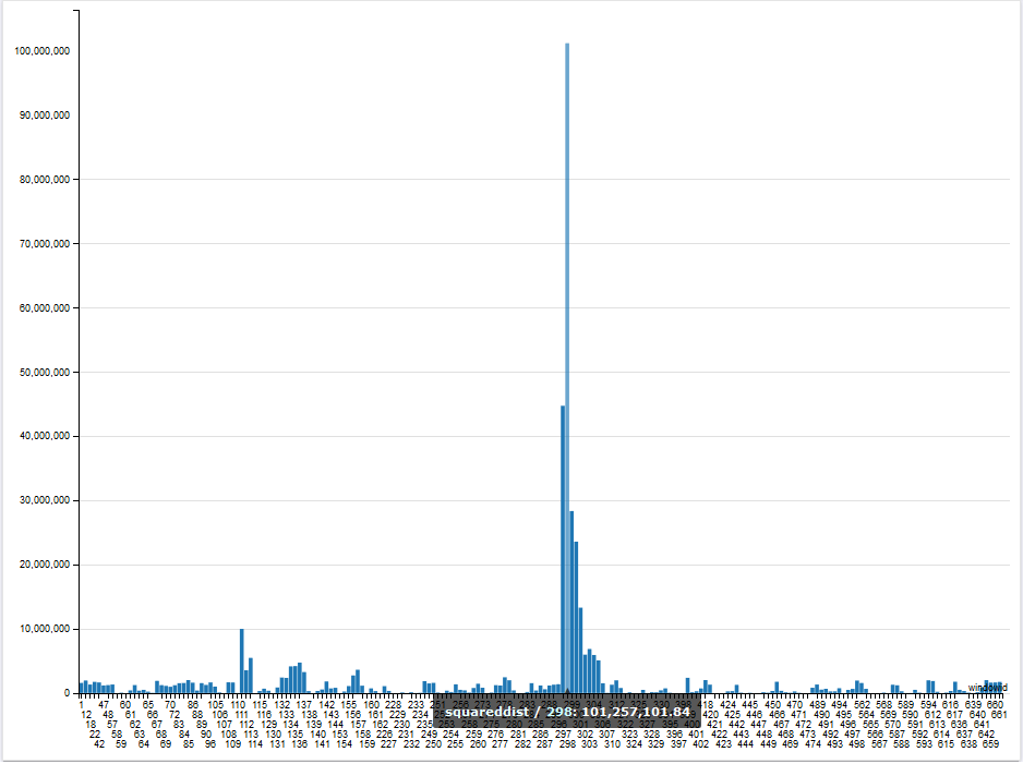
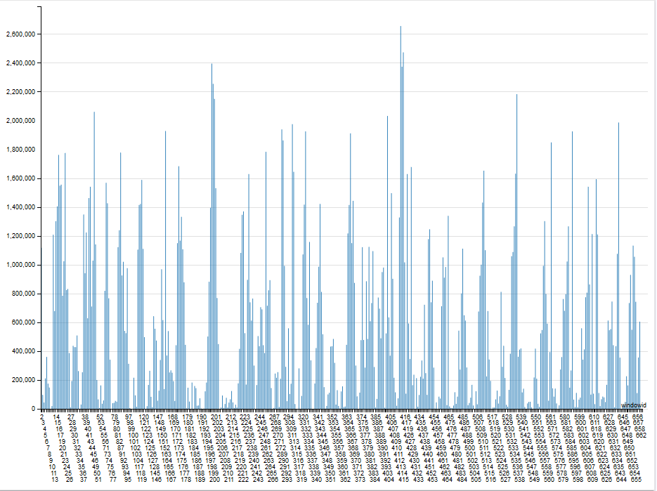
From this plot, I selected thresholds for each cluster and got the following 11 potential abnormal windows:


Comparing those potential abnormal windows to the centroids, we can conclude that they respectively represent windows with highest (on the left) and lowest (on the right) activity.
